
Are you tired of websites that have poor quality designs on your mobile device? Do you have questions about why some websites don't look good on your phone? Send us an email for more information. Are you frustrated with having to zoom in and out on your mobile site just to read a single sentence? Here are some questions to ask yourself and reasons why you should keep your client abreast of this issue. Well, fret no more! Responsive web design services are here to save the day and make your browsing experience smooth as butter on any mobile site or device. With quality designs, these services ensure that your website traffic is maximized and that your site is user-friendly on all platforms.
With responsive web design services, you can say goodbye to pixelated images and wonky layouts on your client's friendly site. These services will showcase your skills in creating stunning designs that adapt seamlessly across devices. These responsive website designs ensure that your work adapts seamlessly to different screen sizes and devices, whether it's a desktop, tablet, or even one of those fancy newfangled smartwatches. With these skills, your website will be able to provide a great user experience across all devices.
Our Web Design Agency takes responsive web designs seriously. Our team works diligently to ensure that our work meets the needs and expectations of our clients. Our team of skilled designers and developers work on website designs using flexible layouts and media queries for optimal user experience. We prioritize client satisfaction through effective project management. We believe in providing an optimal viewing experience for users, especially for web designers. Because let's face it - nobody likes squinting at their screens or playing hide-and-seek with buttons on a responsive website design.
So why settle for website designs that only look good on one screen when you can have stunning designs that wow every client, no matter what gadget they're using? With our talented team and efficient project management, we ensure that your website stands out and performs flawlessly across all devices. With our responsive web design services, our team will work closely with you and your client to create sleek and stylish designs that are sure to impress. Our project management skills ensure that we deliver high-quality results that reach a wider audience. Say goodbye to frustration and hello to seamless browsing!
Benefits of Responsive Web Design
In today's digital era, having responsive web designs is crucial for businesses to thrive and succeed online. The client and the team at Bounce Back Digital understand the importance of this. With the increasing use of mobile devices, it has become essential to provide users with a seamless browsing experience across different screen sizes. This is where a responsive website design comes in. A responsive web designer ensures that your website is optimized for all devices, creating a responsive site that adapts to different screen sizes. Bounce Back Digital's responsive web design services offer numerous benefits for our clients, positively impacting user experience, search engine rankings, and overall business success. Our team is dedicated to providing top-notch services that ensure our clients' websites are optimized for all devices and platforms. Trust the expertise of Bounce Back Digital to deliver exceptional results for your business.
Improved User Experience
One of the key advantages of responsive web design is its ability to enhance user experience for our clients by providing consistent functionality across various devices. This is especially important for our team at Bounce Back Digital. Whether clients access your Bounce Back Digital website on a desktop computer, tablet, or smartphone, they will enjoy a seamless and visually appealing interface. Our team ensures that users have a great experience regardless of their device. The responsive website design ensures that the layout of the responsive site adapts dynamically to fit the screen size, providing a web solution that keeps the content easily readable and navigable. This positive outcome leads to increased engagement and longer visit durations as clients can effortlessly interact with your website regardless of their preferred device. The team at Bounce Back Digital ensures a smooth user experience for all visitors.
Higher Search Engine Rankings
Websites designed by the team at Bounce Back Digital with responsive designs have higher chances of ranking well in search engine results pages (SERPs) and attracting more clients. Search engines like Google prioritize mobile-friendly websites to deliver the best possible user experience to their users, which includes both the client and team. By investing in responsive web design services, the client improves their site's chances of appearing prominently in search results when users search for relevant keywords or phrases. This is why it is important for the client to work with a reputable agency like Bounce Back Digital that specializes in responsive web design services. This positive feedback from search engines can significantly boost your online visibility and attract more organic traffic to your responsive website. It is important to choose one of the top responsive web design companies to ensure that your client's responsive site is optimized for search engines.
Reduced Bounce Rates
Mobile responsiveness is essential for reducing bounce rates on your website and ensuring a positive user experience for clients. When visitors land on a website that is not responsive, they often encounter usability issues such as distorted layouts or difficult navigation. This can lead to a negative experience for the client. Frustrated users are more likely to leave a responsive website or responsive site immediately without exploring further pages or engaging with your content. The client is important in ensuring a positive user experience. However, with a responsive design, clients can seamlessly navigate through your website on their preferred device without encountering any obstacles. This ease of use encourages visitors to explore more pages on the responsive site and increases the likelihood of conversions for the client.
Time and Resource Savings
By opting for a single responsive website, you eliminate the need for separate mobile and desktop versions, providing a better user experience for your client. This consolidation saves both time and resources for the client that would otherwise be spent on developing and maintaining multiple versions of your site. With responsive web design services, you can allocate your resources more efficiently, focusing on improving the overall user experience for your client rather than managing different platforms. This streamlined approach allows you to make updates or changes to your website seamlessly across all devices, ensuring consistency in branding and messaging for your client.
Competitive Advantage
In today's highly competitive digital landscape, businesses with responsive websites gain a significant advantage over their competitors. The increasing number of people using mobile devices to browse the internet highlights the importance of catering to this audience effectively. By providing a seamless user experience across various devices, you position your business as modern, reliable, and customer-centric. This positive perception can lead to increased brand loyalty and customer retention while attracting new customers who appreciate the convenience and accessibility offered by your responsive website.
Importance of Mobile-Friendly Websites
In today's digital world, having a mobile-friendly website is not just important, it's crucial. With the widespread use of mobile devices surpassing desktop usage worldwide, businesses cannot afford to ignore the significance of catering to mobile users. Let's delve into why mobile-friendly websites are so essential and how they can impact your web presence.
Mobile Usage Surpassing Desktop
The rise of smartphones and tablets has revolutionized the way people access information and interact with businesses online. More and more individuals are using their mobile devices to browse the internet, shop, and connect with others. In fact, recent statistics show that mobile usage has surpassed desktop usage globally.
As a business owner or marketer, this shift in consumer behavior should not be taken lightly. Ignoring the needs of mobile users means missing out on a significant portion of potential customers or clients. By investing in responsive web design services that ensure your website is optimized for mobile devices, you can tap into this vast market and reach your target audience effectively.
Google's Prioritization of Mobile-Friendly Websites
Ranking well on Google is paramount for driving organic traffic to your website. One crucial factor that Google takes into account when determining search rankings is the mobile-friendliness of websites. The search engine giant recognizes the importance of delivering a positive user experience on mobile devices.
Google's algorithm favors websites that are designed responsively and provide a seamless browsing experience across different screen sizes. This means that if your website is not optimized for mobile devices, it may suffer in terms of organic visibility in search results. To maintain or improve your website's ranking on Google and attract more visitors, ensuring its responsiveness on all platforms is vital.
User Experience Impact
A non-mobile friendly website can have detrimental effects on user experience (UX). When users visit a site that is not optimized for their mobile device, they often encounter issues such as slow loading times, distorted layouts, and difficult navigation. These frustrations can lead to a poor overall experience, causing visitors to leave your site and seek alternatives.
In today's fast-paced digital landscape, users expect instant access to information and seamless browsing experiences on their mobile devices. If your website fails to meet these expectations, you risk losing potential customers or clients to competitors who have invested in responsive web design services. By prioritizing mobile-friendliness, you can provide a positive UX that keeps visitors engaged and encourages them to explore further.
Enhancing Brand Reputation
Your website serves as a digital storefront for your business, representing your brand online. A mobile-friendly website not only improves user experience but also enhances brand reputation and credibility among smartphone users. When visitors have a smooth and enjoyable browsing experience on their mobile devices, they are more likely to view your business positively.
On the other hand, if users encounter difficulties while navigating through a non-mobile friendly site, it reflects poorly on your brand. They may perceive your business as outdated or unprofessional, leading them to question the quality of your products or services. By investing in responsive web design services and creating a mobile-friendly website, you can strengthen your brand image and build trust with potential customers.
Prioritizing Mobile-Friendliness for Success
In today's digital landscape where mobile devices dominate the market, prioritizing mobile-friendliness is no longer optional.
Our Recent Web Design Projects

Ferguson Law Firm

Attorney Steven Toups
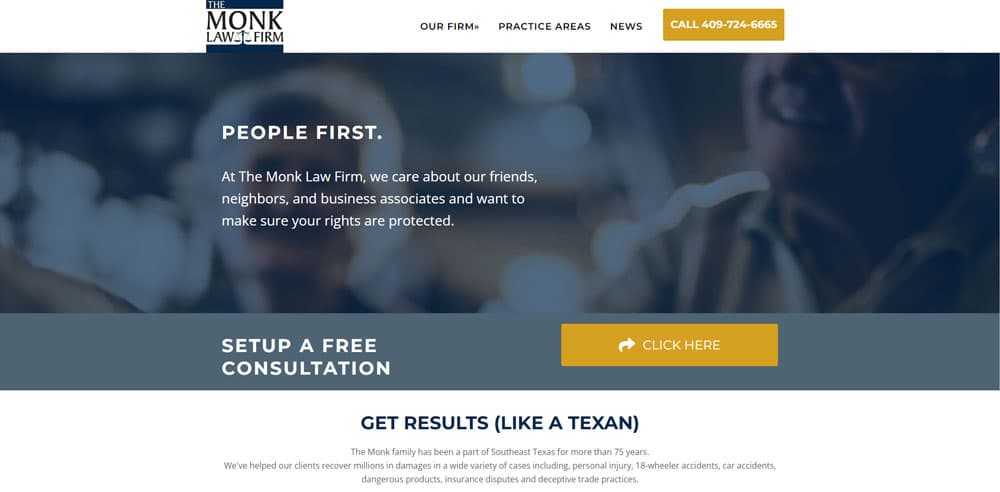
The Monk Law Firm
Ready to Partner with Us so We can Grow Your Business?
Key Features of Responsive Web Design
Fluid Grid Layouts
One of the key features of responsive web design services is the use of fluid grid layouts. This allows the content on a website to adjust proportionally based on the screen size without breaking the layout structure. In simpler terms, it means that whether you're viewing a website on a large desktop monitor or a small smartphone screen, the content will adapt and fit perfectly without any awkward spacing or overlapping.
Imagine browsing a website on your phone and having to constantly zoom in and out just to read the text or view images. With responsive design, this frustration is eliminated as the fluid grid layout ensures that everything scales appropriately. It provides a seamless user experience across different devices, making it easier for visitors to navigate and consume content.
Media Queries for Targeted Styling
Another important aspect of responsive web design is the use of media queries. These enable targeted CSS rules based on specific device characteristics like screen width or orientation. By using media queries, designers can customize how elements are displayed on different devices.
For example, let's say you have a navigation menu that looks great on larger screens but becomes cluttered when viewed on smaller screens. With media queries, you can create specific styling for smaller screens, such as transforming the navigation menu into collapsible menus or icons. This optimization helps to optimize space and improve usability for mobile users.
Media queries also allow designers to apply different styles based on breakpoints, which are specific screen sizes where certain design changes take effect. This level of control ensures that websites look their best at every possible screen size.

Flexible Images for Seamless Scaling
Responsive web design wouldn't be complete without flexible images. These images automatically scale down or up depending on the available space without losing quality or distorting proportions. This means that no matter what device someone is using to view your website, they will see visually appealing images that fit perfectly within their screen dimensions.
Flexible images are achieved through CSS techniques, such as setting the maximum width of an image to 100%. This ensures that the image will never exceed its original size and prevents it from overflowing outside its container. Using responsive image formats like SVG (Scalable Vector Graphics) allows for even more flexibility as they can be scaled infinitely without any loss in quality.
By incorporating flexible images into your responsive design, you create a visually appealing experience for users across all devices, enhancing the overall functionality and aesthetics of your website.
Optimized Navigation Menus
Navigation menus play a crucial role in user experience, and responsive web design takes this into account. On smaller screens, navigation menus often transform into collapsible menus or icons to optimize space. This ensures that visitors can easily access different sections of your website without feeling overwhelmed by a cluttered interface.
For example, instead of displaying a horizontal menu bar on mobile devices where space is limited, a responsive design might use a hamburger icon that expands into a vertical menu when clicked. This approach allows users to navigate through the site effortlessly while maintaining an uncluttered layout.
The key here is prioritizing content hierarchy – making sure that the most important information is easily accessible on any device. By optimizing navigation menus for responsiveness, you create a seamless browsing experience for users regardless of their screen size or device type.
Best Practices for Responsive Web Design
Start with a Mobile-First Approach
One of the best practices is to use a mobile-first approach. This means focusing on designing for the smallest screen size first and then scaling up for larger devices. By prioritizing mobile design, you ensure that your website is optimized for users who primarily access it on their smartphones or tablets.
Designing with a mobile-first approach allows you to create a seamless and user-friendly experience across all devices. It forces you to prioritize essential content and features, making sure they are easily accessible on smaller screens. This approach also helps improve loading times since you're not burdening mobile users with unnecessary elements designed for larger screens.
Optimize Images and Media Files
Optimizing images and media files is crucial for responsive web design. Large file sizes can significantly impact load times, especially on slower internet connections or older devices. To ensure optimal performance across devices, it's important to compress images without compromising quality.
There are several techniques you can employ to optimize images. One option is using responsive image formats such as WebP or JPEG 2000 that offer better compression rates compared to traditional formats like JPEG or PNG. Consider using lazy loading techniques where images are loaded only when they come into view, reducing initial page load times.
Apart from optimizing images, make sure to also optimize other media files such as videos or audio elements. Compressing these files can help reduce bandwidth usage and improve overall website performance.
Implement Touch-Friendly Elements
With the majority of internet users accessing websites through touch-enabled devices, it's essential to implement touch-friendly elements in your responsive web design. These elements make it easier for users to interact with your website using their fingers rather than a mouse pointer.
One way to enhance touch-friendliness is by incorporating larger buttons that are easy to tap on small screens. Small buttons can be frustrating to use on touch devices, leading to accidental clicks or user frustration. By making buttons larger and providing enough spacing between them, you create a more intuitive and user-friendly experience.
Similarly, ensure that links are easy to tap on mobile screens. Avoid placing links too close together as it can be challenging for users with larger fingers to accurately tap the desired link. Sufficient spacing between links helps prevent accidental taps and improves overall usability.
Test Responsiveness on Various Devices
To deliver a consistent user experience across different devices, it's crucial to test your responsive website on various screen sizes and devices. This ensures that your design adapts seamlessly to different resolutions, aspect ratios, and orientations.
Consider testing your website on popular smartphones, tablets, laptops, and desktop computers. Emulators or browser developer tools can help simulate different screen sizes without needing access to physical devices. However, it's always recommended to test on real devices whenever possible for accurate results.
During testing, pay attention to how elements rearrange themselves based on screen size and orientation changes. Ensure that content remains readable and accessible regardless of the device being used. Testing will help identify any issues or inconsistencies in the responsive design so that you can make necessary adjustments.
Regularly Update and Maintain Your Responsive Website
Responsive web design is an ongoing process that requires constant updates and maintenance. Technology evolves rapidly, new devices are introduced regularly, and user expectations change over time.
Let Our WordPress Experts Maximize Your Conversions
Choosing a Responsive Web Design Service Provider
There are several key factors to consider. By selecting a reliable and experienced company, you can ensure that your website will be visually appealing, functional across different devices, and aligned with your business goals. Let's dive into some important aspects to keep in mind during the selection process.
Expertise in Responsive Web Design and Successful Projects
One of the first things to look for when choosing a responsive web design company is their expertise in this specific field. You want to partner with professionals who have a deep understanding of responsive design principles and have successfully implemented them in previous projects. Take the time to review their portfolio and see if they have worked on websites similar to yours or within your industry. This will give you an idea of their capabilities and whether they can deliver quality designs that meet your expectations.
Understanding Your Business Goals
A great responsive web design service provider should not only excel in technical skills but also understand your unique business goals. They should take the time to listen and comprehend what you aim to achieve through your website. By aligning their work with your objectives, they can create a website that effectively communicates your brand identity while catering to the needs of your target audience. Look for designers who ask insightful questions about your business during initial consultations – this demonstrates their commitment towards delivering tailored solutions.
Visually Appealing Designs with Functionality Across Devices
Responsive web design is all about ensuring that your website looks great and functions properly on various devices, including desktops, tablets, and smartphones. When evaluating potential service providers, pay attention to their ability to strike a balance between visual appeal and functionality across these different platforms. A well-designed website should provide an optimal user experience regardless of the device being used.
Reputation, Reliability, and Customer Satisfaction
To gauge the reputation of a responsive web design company, it's important to check client reviews or testimonials. This will give you insights into their reliability, professionalism, and customer satisfaction levels. Positive feedback from previous clients indicates that the company has a track record of delivering satisfying project management processes, timely delivery, and excellent project management skills. On the other hand, negative reviews can be red flags that suggest potential issues with communication, quality of work, or adherence to timelines.
Pricing Models, Project Timelines, Communication Channels, and Post-Development Support
When comparing different responsive web design service providers, consider factors such as pricing models, project timelines, communication channels, and post-development support. Pricing models can vary – some companies charge a fixed fee while others may have hourly rates or offer package deals. Evaluate what aligns best with your budget and requirements. Inquire about the estimated timeline for completing your project to ensure it fits within your desired timeframe.
Communication is crucial throughout the web design process. Ensure that the company provides convenient channels for effective collaboration and updates on progress. Whether it's through email, phone calls, video conferences or project management tools – find out how they keep clients abreast of developments.
Lastly but importantly, inquire about post-development support offered by each service provider. Websites require ongoing maintenance and updates after launch. Check if they provide any maintenance packages or additional services to help you keep your website up-to-date and secure.
What Our Clients Say
Optimizing Responsive Web Design for SEO
In today's digital landscape, having a responsive web design is crucial for the success of your website. But it's not enough to just have a visually appealing and mobile-friendly site. To truly optimize your responsive web design for SEO, there are several key factors you need to consider.
Ensure fast page loading speeds
One of the most important aspects of optimizing your responsive web design for SEO is ensuring fast page loading speeds. Slow-loading websites not only frustrate users but also negatively impact search rankings. To improve loading times, you can start by optimizing your code and minimizing unnecessary elements that may slow down the website.
Compressing images without compromising quality can significantly reduce file sizes and improve load times. Leveraging caching techniques, such as browser caching or content delivery network (CDN) caching, can also enhance user experience by storing static resources closer to users' locations, resulting in faster load times.
Implement structured data markup
Structured data markup plays a vital role in helping search engines understand the content structure of your website better. By implementing schema markup on your pages, you can provide additional context about your content and make it easier for search engines to interpret and display relevant information in search results.
For example, using structured data markup allows you to highlight specific details like product prices, ratings, or event dates directly in search engine snippets. This enhanced visibility can lead to higher click-through rates and improved organic traffic.
Use proper heading tags
Properly utilizing heading tags (H1-H6) within your content is essential for providing a hierarchical structure that enhances SEO visibility. Heading tags help both users and search engines understand the organization of your content and identify key sections or topics.
When creating headings, ensure they accurately represent the content beneath them while incorporating relevant keywords naturally. By organizing your content with appropriate heading tags, you make it easier for search engines to crawl and index your website, ultimately improving its visibility in search results.
Optimize meta tags for mobile users' search intent
Meta tags, including title tags and meta descriptions, have a significant impact on how your website appears in search engine results. When optimizing for responsive web design, it's important to consider the search intent of mobile users specifically.
Craft compelling title tags that capture the essence of your content while being concise and relevant to mobile users' needs. Similarly, optimize meta descriptions by providing a concise summary that entices users to click through to your website. Balancing relevance and clarity is crucial here, as you want to attract mobile users without sacrificing the overall message or purpose of your content.
Focus on creating high-quality and optimized content
While technical aspects are essential for SEO optimization, creating high-quality content remains at the core of any successful strategy. When developing content for your responsive web design, focus on providing value to your audience through engaging and shareable information.
Ensure that your content is optimized for relevant keywords related to your industry or niche. Conduct thorough keyword research using tools like Google Keyword Planner or SEMrush to identify popular search terms with manageable competition levels. By incorporating these keywords naturally into your content, you increase its chances of ranking higher in search results.
The Importance of Responsive Web Design
In today's digital landscape, having a responsive web design is crucial for the success of your business. With the increasing use of mobile devices, it's essential to ensure that your website adapts seamlessly to different screen sizes and resolutions. A responsive web design allows your site to be easily accessible and visually appealing on any device, whether it's a smartphone, tablet, or desktop computer.
By implementing responsive web design, you can reap numerous benefits. Firstly, it enhances user experience by providing a consistent and optimized browsing experience across all devices. This not only keeps visitors engaged but also encourages them to stay longer on your site and explore further. A mobile-friendly website is favored by search engines like Google, leading to higher rankings in search results.
To make the most out of responsive web design, consider partnering with a reliable service provider who specializes in this field. They can ensure that your website is designed and developed with the latest industry standards in mind. Remember that investing in responsive web design is an investment in the growth and success of your business.
FAQs
What are the key components of a responsive web design?
A responsive web design consists of several key components such as flexible grids and layouts, media queries for adapting content based on screen size, and fluid images that scale proportionally.
How does responsive web design affect SEO?
Responsive web design positively impacts SEO as it provides a better user experience across devices. Google considers mobile-friendliness as one of its ranking factors for search results.
Can I convert my existing website into a responsive one?
Yes, it is possible to convert an existing website into a responsive one by making necessary adjustments to the codebase or redesigning certain elements.
How long does it take to develop a responsive website?
The time required for developing a responsive website depends on various factors such as complexity, size of the site, and specific requirements. It is best to consult with a web design service provider to get an accurate estimate.
Will a responsive website work on all devices?
Yes, a properly implemented responsive web design should work seamlessly on all devices, including smartphones, tablets, laptops, and desktop computers.
Our WordPress Web Design Team is Ready to Help Your Business Bounce Back and Succeed Online.